Brand Guide
Using my instructor’s template, I created a brand guide for MerrydoesNails that reflects my creativity, personality, and passion for nail artistry. It establishes a consistent brand identity while highlighting my commitment to nail health, quality, and personalized client experiences.
Mood Board
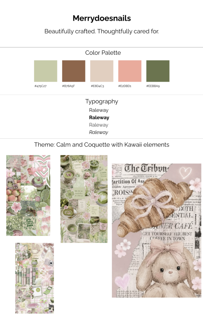
I created this mood board based my love for coquette aesthetics, combining soft pinks and greens to create a look that feels feminine, playful, and chic. These colors and visual elements capture the personality of my brand, MerrydoesNails, while expressing my creativity and love for beauty.
Reflection
I approached my brand workbook and mood board by exploring the personality and values I want MerrydoesNails to represent. I wanted my brand to feel feminine, creative, and playful while still maintaining a professional and welcoming atmosphere. My values focus on creativity, attention to detail, nail health, and taking the time to perfect my craft. I also wanted my brand to reflect the care and personalized experience I strive to provide for every client.
For my visual identity, I chose a coquette-inspired aesthetic with soft pink and green tones to create a look that feels sweet, chic, and refreshing. I want my tagline and typography to reflect my personality while remaining clear, inviting, and easy to read. These choices help create a balance between the playful side of my brand and the professionalism of my work.
These branding decisions will guide the design of my final website by creating a consistent look and feel across every page. I plan to incorporate my chosen colors, typography, and visual elements to create a cohesive experience that showcases my nail art and communicates my brand’s personality. Ultimately, I want visitors to feel welcomed, get a sense of my creativity, and understand the care and passion behind my work.